Built for our work. Free for yours.

The color tools we made for our own client projects. Use them to find a palette, refine it, and prove it works before it ships.

  • No sign-up
  • Runs in your browser

Find your colors

Start from a word, a photo or a whole mood board.

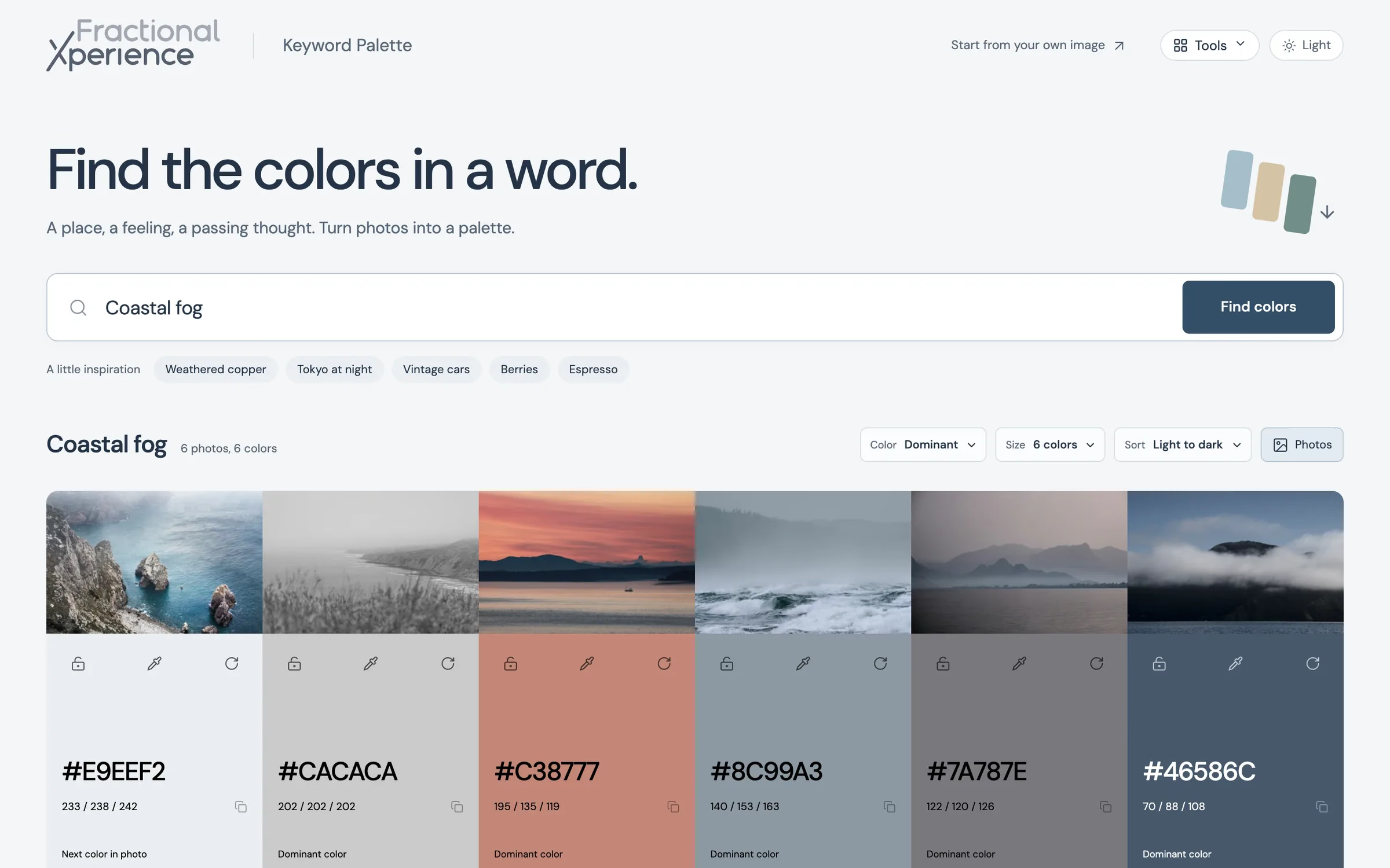
Keyword Palette showing six muted blue-gray and terracotta colors found for the search “Coastal fog”, each under the Unsplash photo it came from.

Keyword Palette

Search to find the colors in a word.

Type a place, a feeling or a passing thought. Keyword Palette searches Unsplash and reduces each photo to its dominant or average color, giving you a 4, 6 or 8-color palette alongside the photos behind it.

  • Dominant or average color from each photo
  • Lock, replace and shuffle individual colors
  • WCAG 2.2 AA contrast guidance, with one-click fixes
  • Export as CSS, JSON, SVG or PNG
Open Keyword Palette(opens in a new tab)
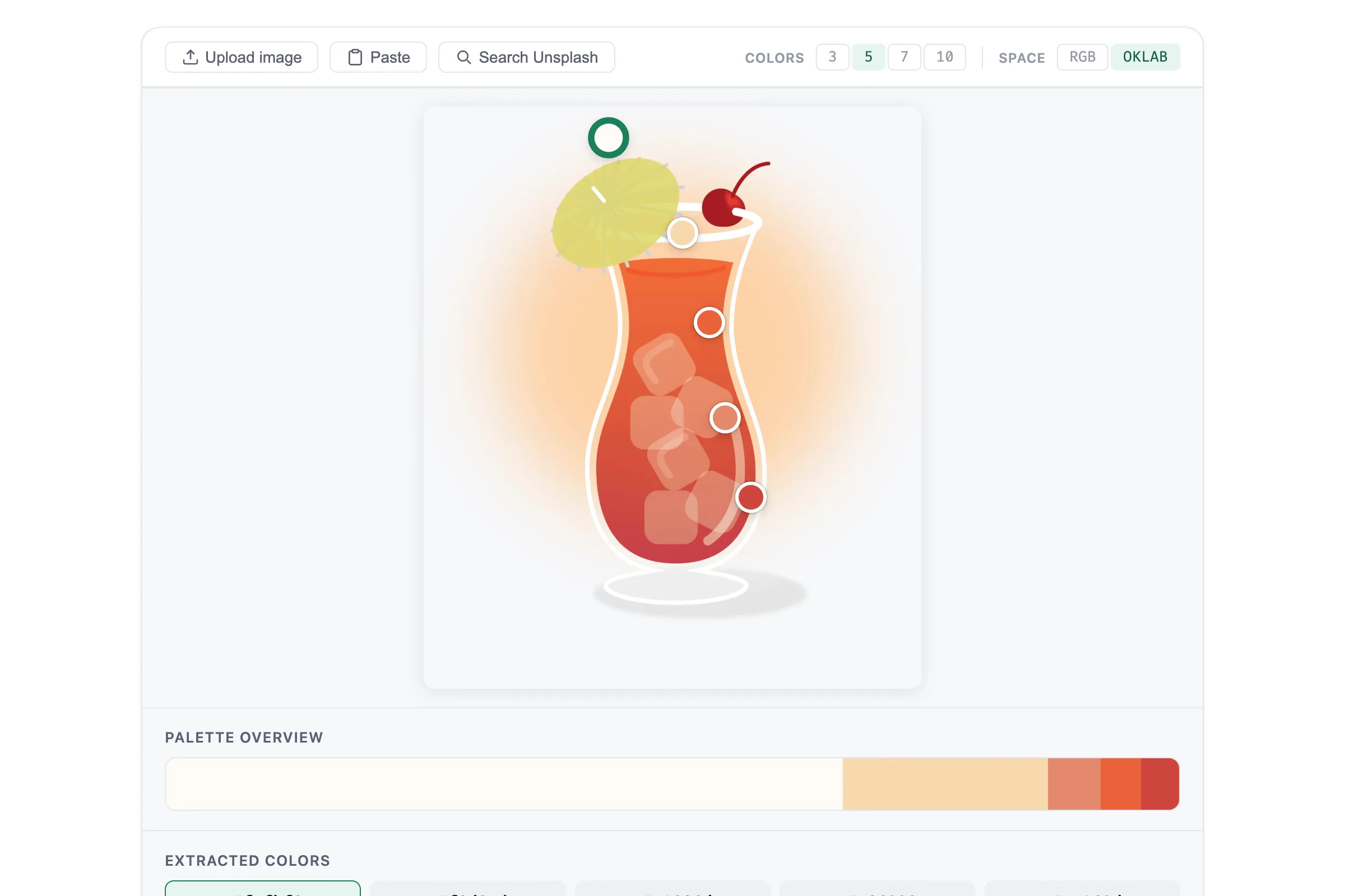
Mood Palette sampling five colors from an illustrated hurricane cocktail, from cream and peach to coral, orange and red.

Mood Palette

Pull a palette out of a photo.

Upload an image, paste one or search Unsplash, and Mood Palette pulls out 3 to 10 colors. Drag the sample points to land on exactly the shade you want, then copy it in the format you need.

  • RGB or perceptual OKLab extraction
  • Draggable sample points on the image
  • Harmony chips and tint tables for each color
  • Flags Display P3 colors, and exports ASE swatches for Adobe apps
Open Mood Palette(opens in a new tab)
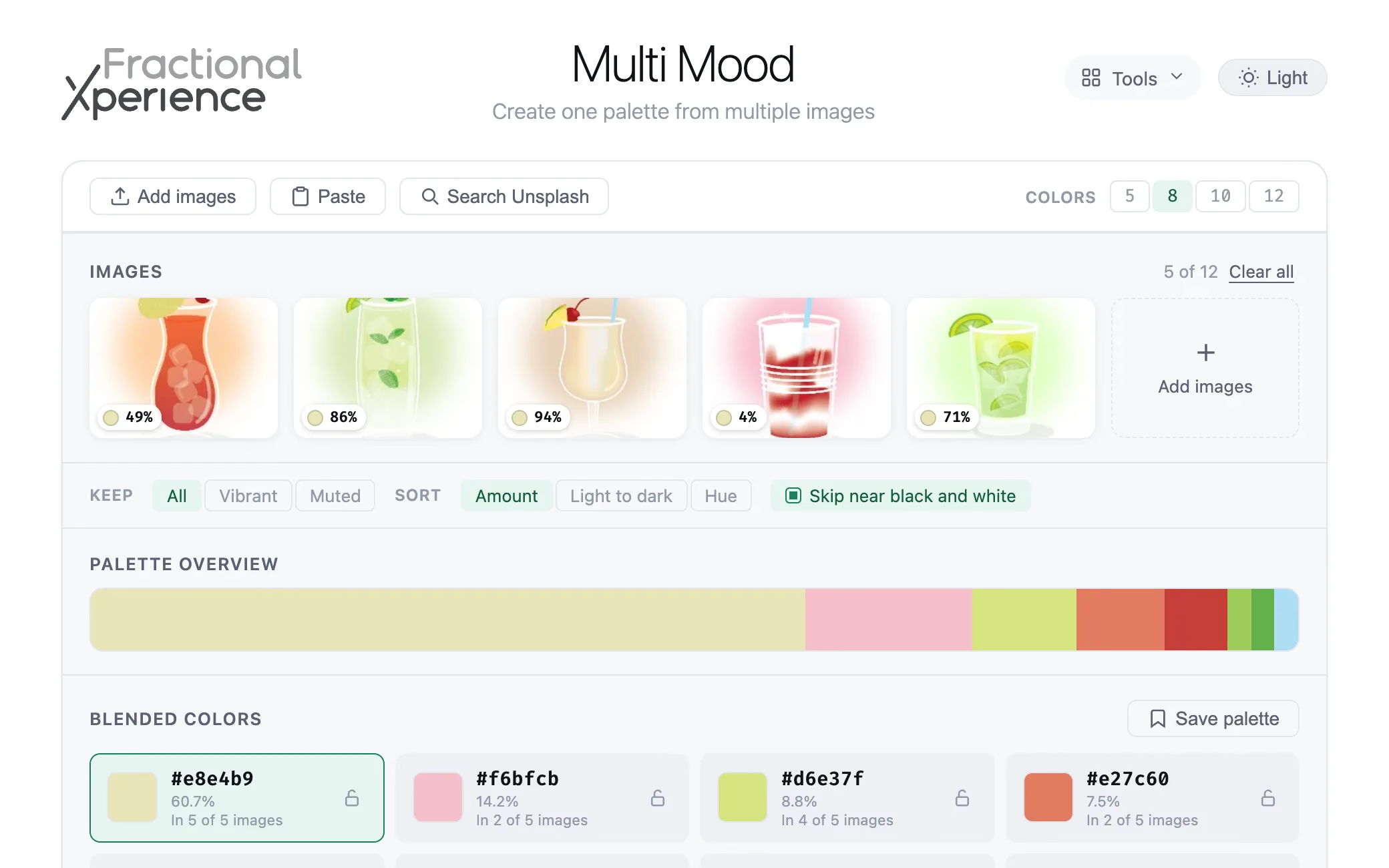
Multi Mood blending an eight-color palette from five illustrated cocktails, with each color’s percentage and image count.

Multi Mood

Create one palette from multiple images.

Building a mood board? Add up to 12 images and Multi Mood blends a single palette from all of them, with each image counting equally. Lock the colors you like and they stay put as you add or remove images.

  • Upload, paste, or add several Unsplash photos at once
  • Each color’s share, and how many images it appears in
  • Keep vibrant or muted colors, and skip near black and white
  • A palette shelf and your workspace, saved in your browser
Open Multi Mood(opens in a new tab)

Shape them

Mold a starting color into a full palette or background.

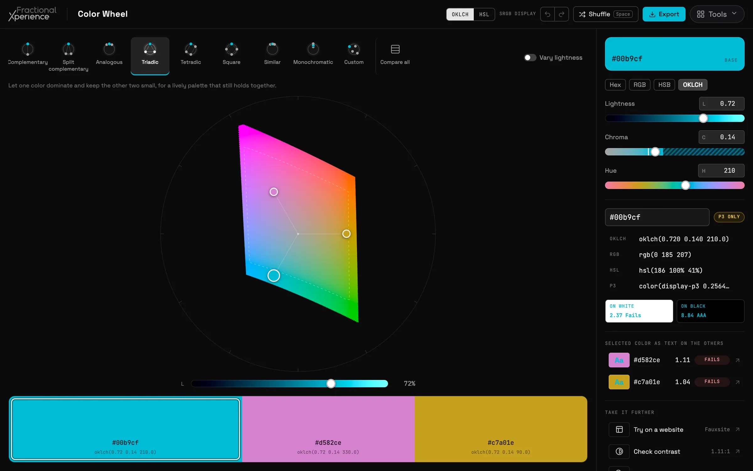
Color Wheel in dark mode building a triadic harmony of cyan, orchid and gold on the Display P3 gamut, with OKLCH sliders and color values alongside.

Color Wheel

Build harmonies on an OKLCH wheel.

A perceptual color wheel that draws the real Display P3 gamut at every lightness. Choose from nine harmony modes, drag colors around the wheel, and each one stays as vivid as your screen can show.

  • Nine harmony modes, with adjustable spread and a compare-all view
  • Locks, shade ramps, shuffle and undo in the palette bar
  • WCAG contrast for each color against white, black and the rest
  • Export CSS variables, Tailwind v4 @theme, JSON, SVG or PNG
Open Color Wheel(opens in a new tab)
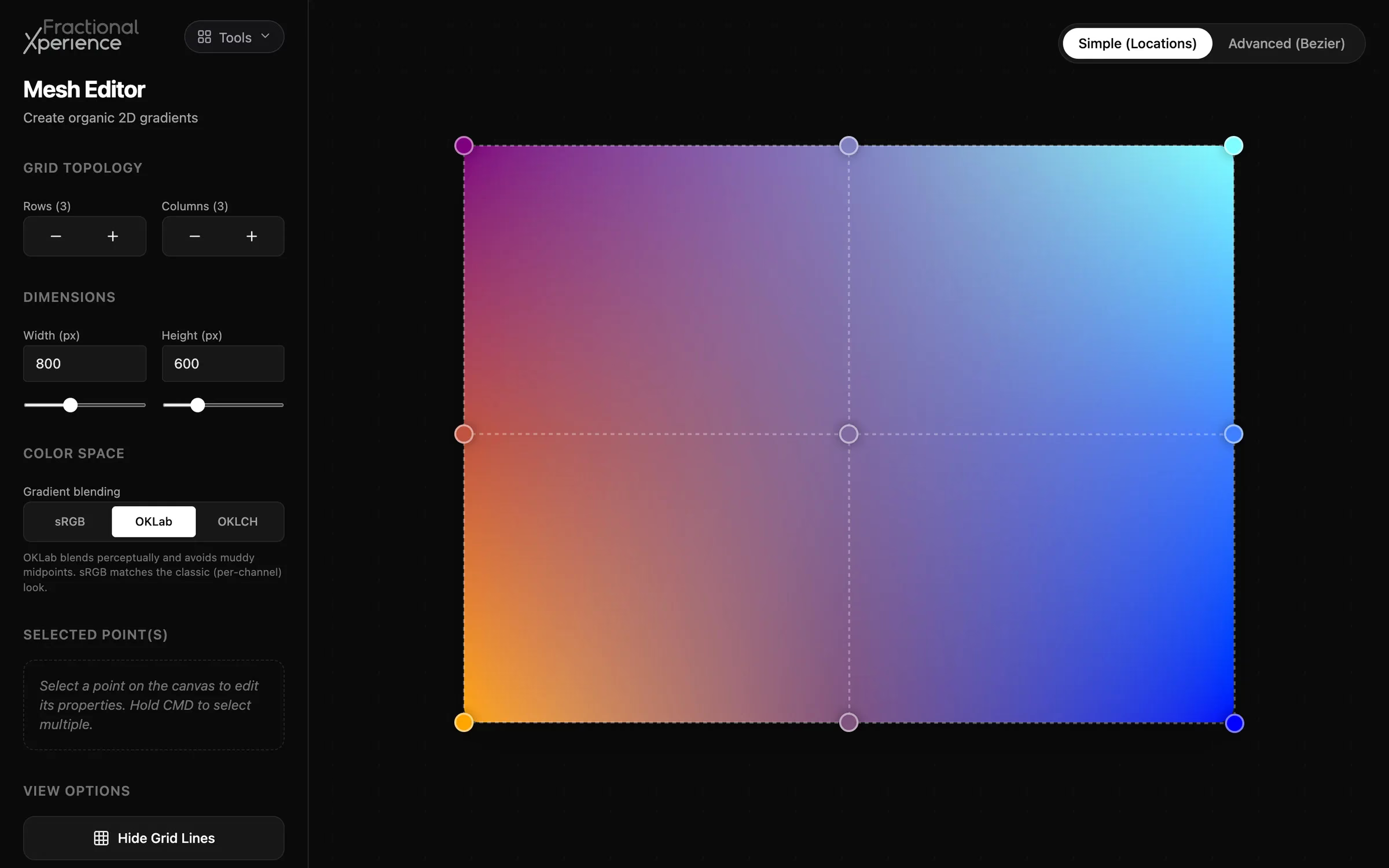
Mesh Gradient Editor with a three by three mesh blending magenta, cyan, orange and blue, beside grid, size and color space controls.

Mesh Gradient Editor

Shape organic mesh gradients in Display P3.

Design soft, organic backgrounds by dragging the points of a mesh. Add rows and columns, switch to Bézier mode for smoother curves, and blend in sRGB, OKLab or OKLCH.

  • An adjustable grid with multi-select control points
  • Simple and Bézier modes
  • An OKLCH picker that renders P3 colors on P3 displays
  • Export CSS, SwiftUI, JSON or PNG, with P3 colors intact
Open Mesh Gradient Editor(opens in a new tab)

Test them

Check they’re readable, then see them on a real interface.

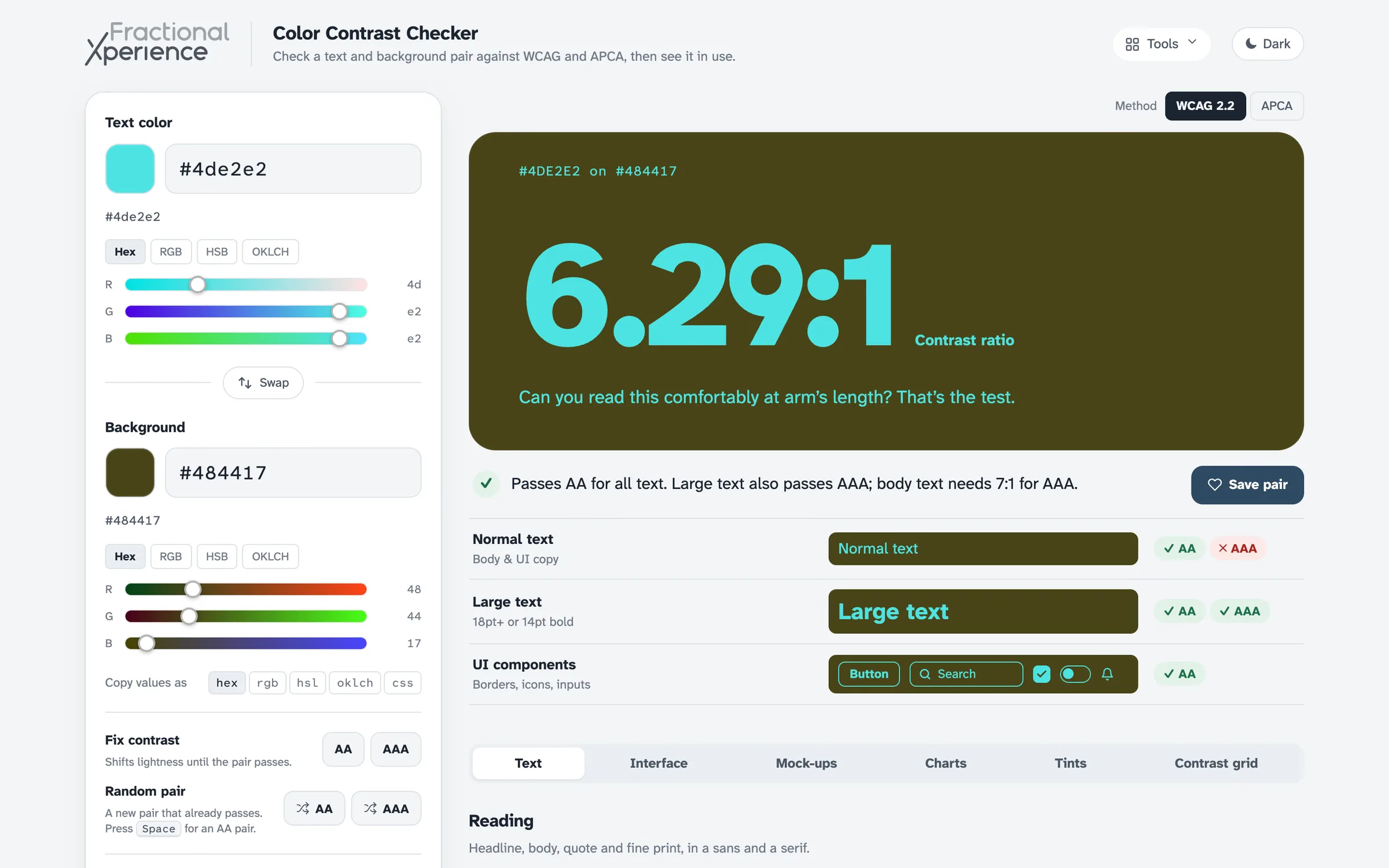
Color Contrast Checker testing cyan text on an olive background at a 6.29 to 1 ratio, with pass and fail badges for normal text, large text and UI components.

Color Contrast Checker

Test text and background pairs against WCAG and APCA.

Check any text and background pair against WCAG 2.2 and APCA, then see it in context: type specimens, mock-ups, charts, and an Interface tab of working components that keeps every mixed shade at passing contrast.

  • WCAG 2.2 ratios and APCA scores side by side
  • Fix contrast shifts a failing pair until it passes
  • Tint scales built four ways, ready to copy as CSS
  • Contrast grids, saved pairs and exportable reports
Open Color Contrast Checker(opens in a new tab)
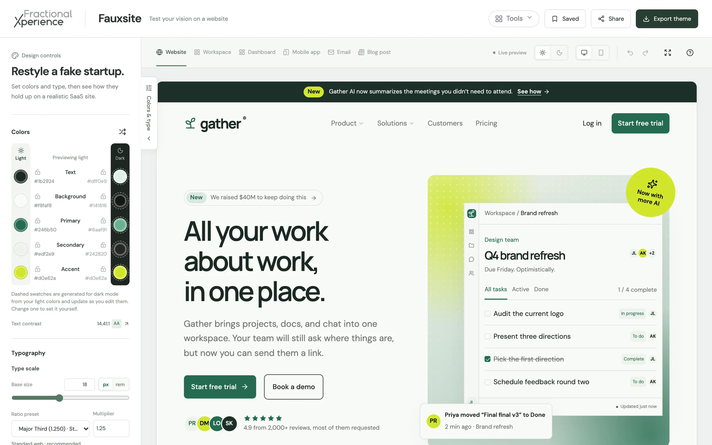
Fauxsite showing a fictional SaaS homepage called Gather, styled in deep green and lime, beside the panel of color roles and typography controls.

Fauxsite

Try colors and fonts on a realistic SaaS website.

See your palette and type pairing live before you commit. Fauxsite puts five color roles and heading and body fonts on a fictional SaaS website and app workspace. See most common interface elements with your selections, instead of just relying on swatches.

  • Light and dark themes, with desktop and phone previews
  • Lock, shuffle and undo colors and fonts, with live contrast readouts
  • The wide-gamut OKLCH picker from Color Wheel
  • Share links, plus CSS and JSON token exports
Open Fauxsite(opens in a new tab)

Help us keep these free!

Every tool is free and always will be. If one saves you an afternoon, a coffee helps us keep building.

Support us on Ko-fi(opens in a new tab)

Working with images too? Our free Mac apps compare and convert JPEG XL, AVIF, WebP and JPEG.

Want this care for color on your product? Let’s talk.

Book a call